Usability Study:
Coulax Alarm Clock
Build, pilot and run a usability study for the Coulax Alarm Clock
Build, pilot and run a usability study for the Coulax Alarm Clock
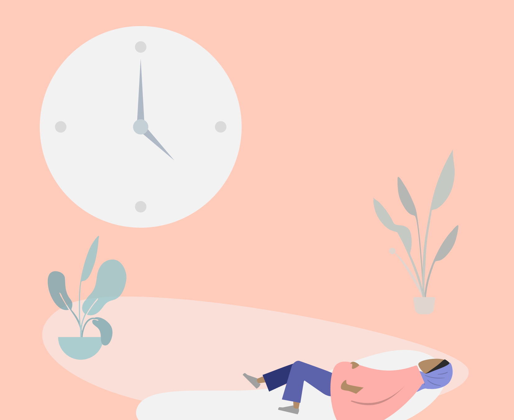
Released in 2017, the Coulax Alarm clock helps users wake up naturally by simulating sunrise. Sounds like a great way to wake up, but how easy is it to use?
As part of a usability assessment course for the Master of Information program at U of T, we were asked to choose a software/hardware of our choice to evaluate its ease of use. As a team, we decided to tackle hardware since it will be an exciting challenge to take on - especially since the Coulax Alarm Clock had special features that a regular alarm wouldn't have (e.g. different colour light settings).
Jan - Feb 2019
UX Researcher
Cher-Ann Chai
Mimi Cheung
Sharon Lam
Interviews
Observations
Surveys
Pre/Post Questionnaires

Determine target audience
We started off by creating user profiles to figure out who is the target audience for this alarm clock. After discussing as a team, we narrowed down our user profile to students and working individuals, since they were more likely to have a need to wake up on time for classes or work.
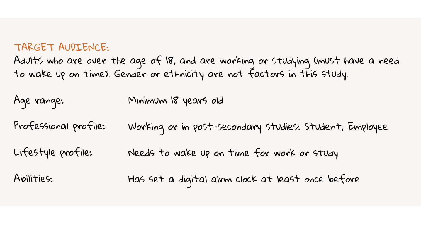
Participant Recruitment and Incentives
We recruited 8 participants matching target audience. Since this is a course project, we were unable to provide any monetary incentives, but we did offer cookies at the end of each session!
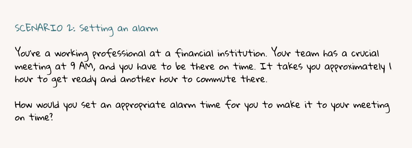
To keep the scenarios as realistic as possible, we wrote scenarios that provided context to the tasks instead of specific instructions to interact with a feature. We also tried to keep the scenarios less ‘step-based’, in order not to implicitely guide the user on how it should be used.
Data Collection Methods
What data do we need to evaluate the usability of this alarm clock?
Keeping this question in mind, we decided to collect the following data:

Quantitative Data:

Qualitative Data:

Limitations:
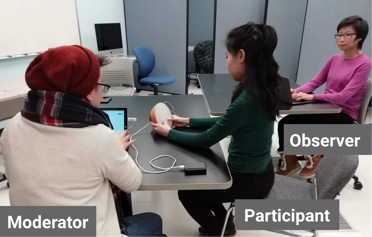
Test Environment Preparation
We were able to use the Usability Lab at U of T to conduct our sessions. We positioned the tables so that the moderator and the observer could see the participant’s face and hand movement on the clock. A piece of tape was marked on the table where the clock was placed, to remind participants to keep the clock in the spot to ensure an unobstructed view of the clock face.
Quantitative Data
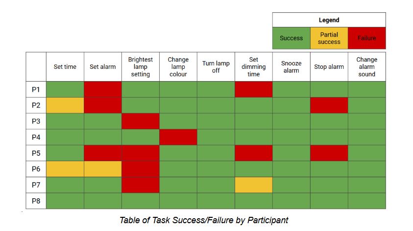
What tasks were the easiest or trickiest?
Based on the graph we created below, the tasks "set alarm" and "[set to] brightest lamp setting" was the trickiest for participants.
Note: We defined task “success” as the full completion of the task: e.g., for setting the alarm, “success” means the participant set the time for the alarm and also turned the alarm status to “on”
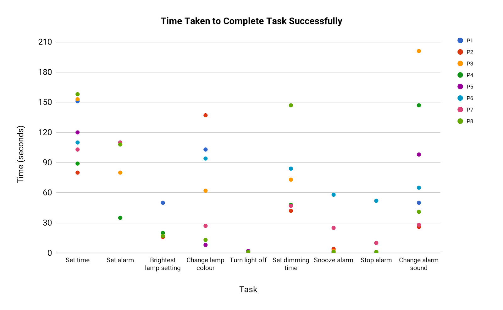
How long did it take to complete each task successfully?
For tasks that took longer and had a greater variation, this could suggest that they are not intuitive. However, these tasks are also more complex and require more 'steps' to complete, so considering the variation between times within each task may be more helpful than comparing times between tasks.
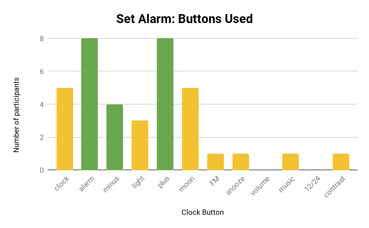
What buttons were pressed for each task?
We created a graph illustrating what buttons were pressed for each task, in order to show whether partcipants pressed unrelated buttons and how many did so. This provides a more granular view of success rate.
Green bars indicate the buttons that need to be pressed to complete the task, while the yellow bars indicate buttons that were pressed but irrelevant to the task. A graph for the task “Setting the Alarm” is shown below, and it shows that quite a few participants mistook the “moon” button for the alarm button.
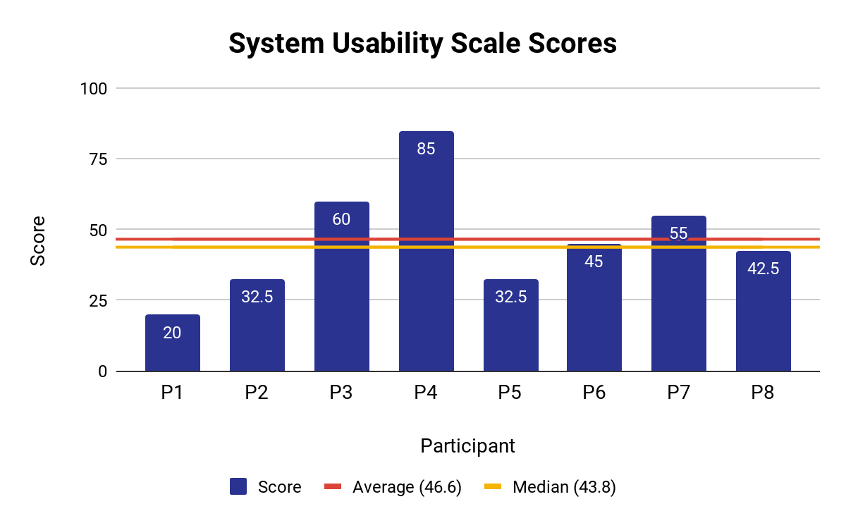
What is the perceived ease of use?
After the usability test, we asked participants to complete a post-questionnaire based on the System Usability Score. The participants’ ratings for the alarm clock scored an average of 46.6, which is below the average score of 68 across 500 studies of different systems.
However, one should note that the questionnaire measures perceived ease of use. Additionally, perceived ease of use may not accord with successful use, e.g. P3 and P8 experienced similar or greater levels of task success compared to P4, but both rated the clock’s usability lower, at 60 and 42.5, respectively.
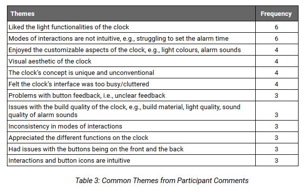
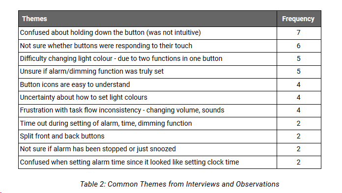
Qualitative Data
From our observation and interview notes, we created two tables of common themes from the sessions.
The frequency count indicates how many participants had experienced the theme, e.g. if the theme had occurred to P1 and P3, then the frequency count would be two.
We decided to focus on qualitative data in our test report, since it helped identify specific problems of the design and shed light behind participants’ behaviours. However, we also referred to our qualitative data to make comparisons and to check for any points that contradict or support these usability issues.
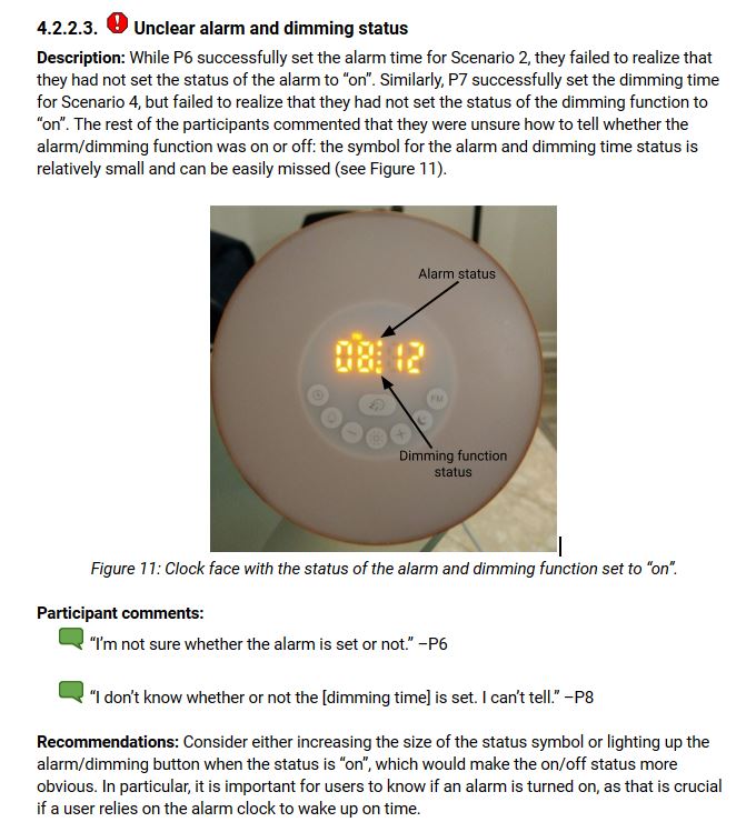
The example provided below is one of the critical usability issues we found. The complete list of usability issues is available in the report here.
Lessons Learned
© 2021 by Gillian Chen